
I’m sure you have heard that in Photography and Art, there aren’t really any rules, or you’ve heard someone say ‘Learn the rules so that then you can break them’.
Composition can be very subjective, there are however some things that work and some things that just don’t. In this blog I will cover some of the ‘Tool’s that we can use as guidelines to help when composing shots in landscape photography.
The aim of these tools and guidelines is to help you take more compelling photographs, giving them a sense of balance and most importantly, leading the viewers eye through the image and drawing attention to the subject of the photograph.
Once you are familiar with these composition tips, you'll be surprised at just how universal most of them are. You'll spot them everywhere, and you'll find it easy to see why some photos "work" while others feel like simple snapshots.

An example of the ‘Rule’ of Thirds in a photograph. The Green lines are the third lines and the Yellow circles show where the thirds intersect. In this shot, the 3 main points of interest are all on the intersecting points of the third lines.
The ‘Rule’ of Thirds
If you divide your image into 9 equal segments by 2 vertical and 2 horizontal lines, the ‘Rule’ implies that you should position the most important elements of the scene in front of you (Especially the Subject) along these lines and where they intersect.
We have a natural tendency to put the subject bang in the middle of our frame, and although this can sometimes work very well (See examples of this below), it shouldn’t be our ‘go to’ composition.

Another example of the ‘Rule’ of Thirds in a photograph. The ‘Subject’ of this photo is the photographer, and they are positioned on the intersecting point between 2 of the third lines.

In this example of the ‘Rule’ of Thirds, the trees are all found along the bottom third of the photograph.
The Golden Ratio
The Golden Ratio is 1:1.61803398875 (Or 1:1.6 to make it simpler).
For the Golden Ratio, instead of a regular grid, the frame is divided into a series of squares as in the example below. If you draw a spiral through the squares you end up with a spiral similar to a snail’s shell, also called a ‘Fibonacci Spiral’. The squares help to position elements in the scene and the spiral gives us an idea of how the scene should flow.
The golden Ratio has been in existence for over 2,000 years and can be seen in loads of historic Art and Architecture.
Although it is good to know about the Golden Ratio, its not something to stress over trying to perfect or use, as the ‘Rule’ of Thirds is effectively a simplified version of this.

A graphical representation of the Golden Spiral / Golden Ratio.
Leading Lines
When we look at an image our eyes are naturally drawn to lines and follow them. As photographers, we can use these lines to our advantage, especially if they lead to our in the general direction of our subject. Taking the time to look for and use these leading lines in your composition, you can help direct the viewer’s eye to your subject.
Leading lines can sometimes be very obvious, but they can also be quite subtle or implied. One of the most effective leading lines is an ‘S Curve’.
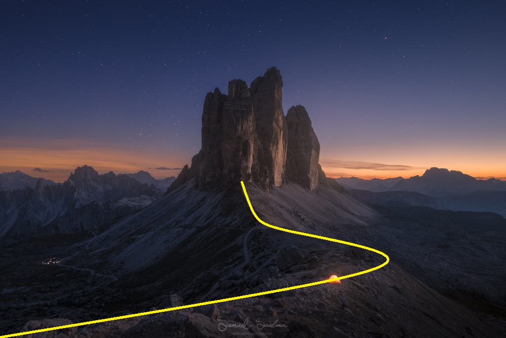
An example of an ‘S Curve’ leading line which pulls the viewers eye from the bottom left corned to the subject, which in this case is the ‘Tre Cime’ in the middle of the photograph.

The hand rails and stairs act as leading lines, directing the viewers eye to the Subject, which in this case is a Photographer.

The banks of the river lead the eye up and into the main area of interest of this photo. The wide angle distortion of the lens adds a ‘Triangle’ shape to the waterfall which is a shape that is easily recognized.

The leading line of the shore from the bottom right corner takes the eye straight into the subject, which is the Castle perched on the hill. The castle is also on the left third line, showing the use of the ‘Rule’ of thirds.
Balance
Although the ‘Rule’ of thirds discourages you from placing your subject to off center, this can sometimes create too much negative space, leaving the image feeling unbalanced. Placing a secondary subject opposite / opposing the main subject can help achieve a more balanced composition. It is important that the secondary subject has less visual impact than the main subject to ensure that it does no over power it.

The main subject in this shot is clearly Kirkjufell Mountain, it sits on the left side of the frame and is balanced out by the person on the right.
Symmetry and Central Compositions
I have explained the ‘Rule’ of thirds and the golden spiral, and pretty much told you to not put your subject in the middle of your frame, I am going to contradict myself and talk about Symmetry and central compositions. We can find symmetry and patterns everywhere we look, they are all around us, both in nature and man-made. Perfect balance in a central or symmetrical composition can make for very effective and striking compositions.

A Mirror reflection of Stokksnes in Iceland is a perfect example of Symmetry. The Blue line indicates the middle of the frame.
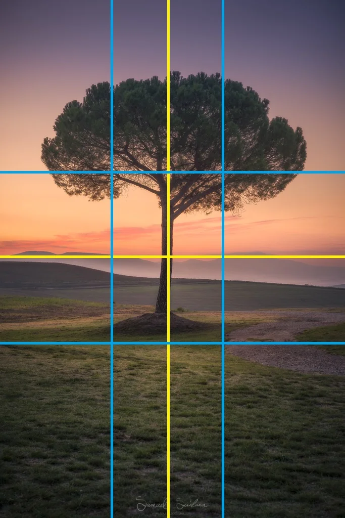
In this photo, I have placed the sole tree in the middle of the shot as I wanted to make it clear that it is the subject of the shot. I have included the blue lines to who the rule of thirds, and how although the composition is central, the top of the tree is intersecting the tree.
Framing
The world is full of objects which make perfect natural frames, such as trees, archways and holes. By placing these around the edge of the composition you help to isolate the main subject from the outside world. The result is a more focused image which draws your eye naturally to the main point of interest.

In this photograph, the Subject (Mount Mirkufell) is framed by Icicles on the right, snow on the bottom and the frozen waterfalls on the left.
Foreground Interest and Depth
Including foreground interest in landscape photos is extremely important as it adds interest to the frame and can work as a visual anchor. Foreground also helps to give a sense of depth to the scene, helping the photo feel more 3 dimensional and have a sense of place.

Adding the cracked ice to the foreground of this image, which has a central compositions helps add depth and give a feel for the area surrounding the mountain. The cracked Ice helps tells the story, showing that this was captured in winter.
Shapes
Our eyes are trained to identify shapes, and one of the most common shapes we identify is the human figure. Our brains break compositions down into the most basic shapes we can identify. Triangles are particularly powerful shapes in composition, as they include diagonal lines. This can add interest and tension to a scene. Lines have different impacts depending on their direction. Horizontal and vertical lines give a feeling of calmness and stability. Diagonal and sloping lines add tension and give a sense of instability.

This photo in an example of multiple different compositional tools. The foreground is full of cracked which work as strong leading lines, taking you directly to the subject, which in this photo is Monte Paterno. The Mountain has a triangular shape, which is easily recognizable and the mountain has been placed on the top third line.
Simplicity / Minimalism
Simplicity can be a very powerful compositional tool. The old adage ‘less is more’ surely applies when it comes to composition. This means eliminating any distractions from the frame, whether they are in the edge of the frame or a central part of the frame, eliminating them means reducing distractions and anything that can take away from the main subject.

Colour
I think colours and the way the various colours in a scene interact is one of the most overlooked compositional tools, but it can have a huge impact on your photos. Colour theory is something that graphic designers, fashion designers and interior designers are all very familiar with. Colour theory is how different colours interact with each other. Some colour combinations complement each other, creating a natural contrast which cans create a very striking image.

Above is a Colour Wheel. This is used to show which colours work best together. Colours which are opposite each other are called complimentary colours as they work well together. As photographers, we can look for scenes that incorporate complimentary colours as a way of creating attractive and striking compositions.

Red / Orange and Blue are opposing colours on the colour wheel and this helps the subject (Wearing a Red/Orange Colour) to stand out and contrast with the cool blue background. I have also placed the Subject on the bottom left intersecting line.
Free space
Free space in a photograph relates to the direction the subject(s) are facing / moving towards, this related heavily to portraiture, but is also true of buildings or objects which have a clear front / back. Just like in sports, if you are taking a photo of a person running for example, there should be more space left in the frame in front of the person than behind them. This implies that there is space in the frame for the person to move into, and helps reduce tension.

In this photograph, the Church is ‘facing’ the left of the frame. So I have purposely allowed more space on the left to avoid tension.

A more complex example of how the different compositional tools can be used in a single image. In this shot there is clear use of leading lines (Red) and the Rule of Thirds (Yellow) Where the primary Subject (Guide) and the secondary subject (The Guide’is reflection) both intersect the rule of thirds.